Restarting careers, rebuilt for clarity.
client
Upwardly Global
role
Design Lead, UI/UX Design
collaborators
Strategy, Design (Art Director, Senior Graphic Designer, Freelance Designer), Development
The Challenge
For someone rebuilding a career from scratch, a confusing website is one more barrier standing between them and help.
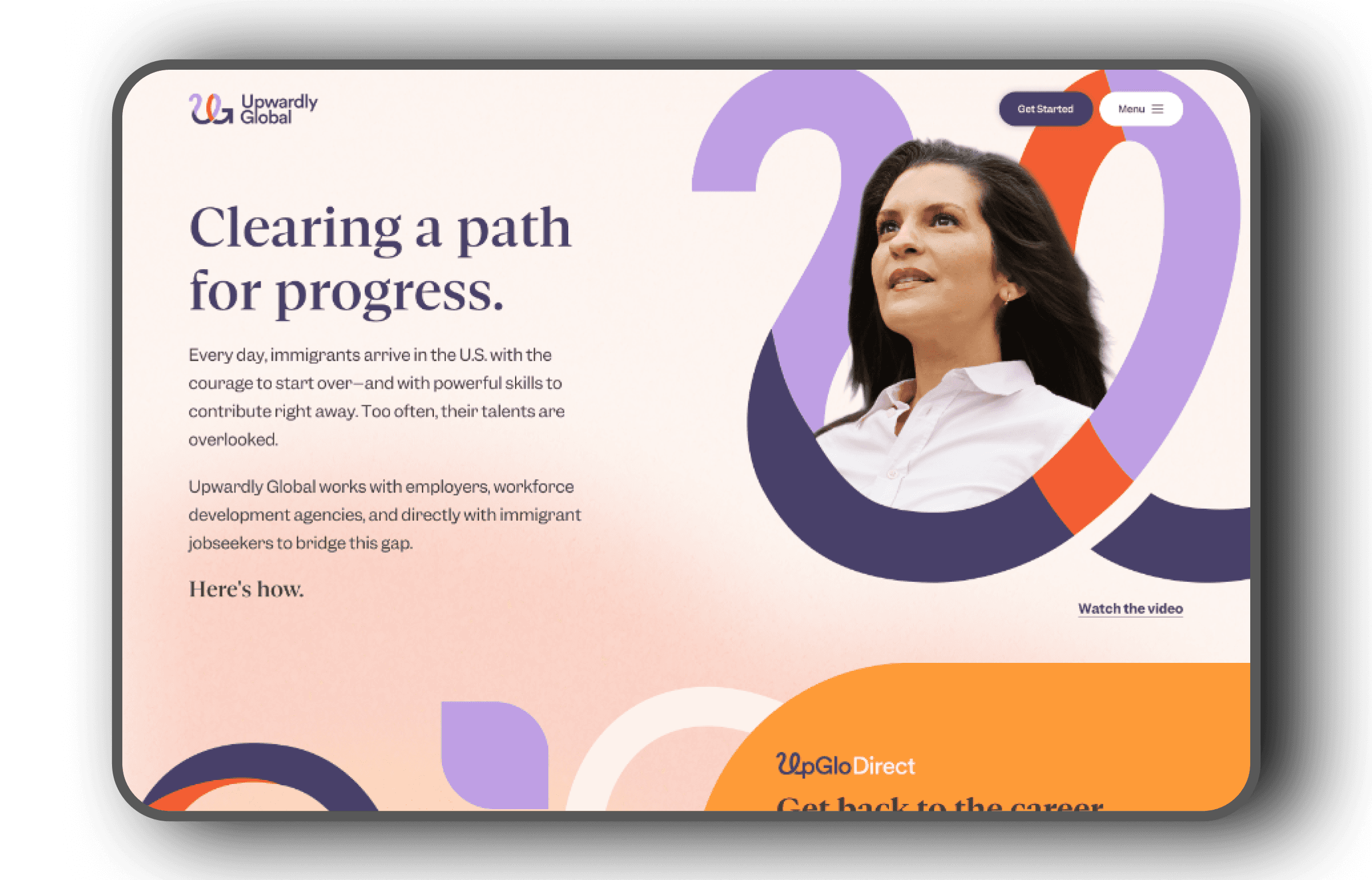
pwardly Global connects work-authorized immigrants, refugees, and asylees with the resources to restart their professional careers in the U.S., a mission that depends on people finding what they need without confusion.
But the existing site had grown unwieldy over time, with pages and content scattered across an information architecture that no longer reflected how visitors actually needed to move through it.
The agency was brought on to rebrand and rebuild the site in tandem, giving Upwardly Global a new visual identity alongside a structure that could actually support its users.
The Project
The agency partnered with Upwardly Global on a full site rebrand and redesign, spanning roughly 80 pages excluding blog and article content. Branding was in development in parallel, giving me visibility into the new visual direction while I worked through sitemapping and wireframes. I led the design work, collaborating with an art director who guided the broader branding direction, a strategist on sitemap and content structure, a senior graphic designer on wireframing, and a freelance designer on select page designs.
role
Design Lead, UI/UX Design
Collaborators
Strategy, Design (Art Director, Senior Graphic Designer, Freelance Designer), Development
Client
Upwardly Global
year
2026
01
Sitemap & IA Simplification
With roughly 80 pages to work through, the first task was making sense of the sprawl. I audited the existing site to identify where content overlapped, where pages could be consolidated, and where restructuring the groupings would help visitors find what they needed faster. The Job Seeker section, for example, went from around 10 pages to 4 plus a single form, folding redundant content into clearer, more navigable groupings.
Reducing the number of forms was part of the original scope, but each internal team maintained its own intake process, and the forms proved essential to how they operated. The sitemap simplification became the primary lever for making the site easier to navigate.

02
AI-Assisted Wireframing
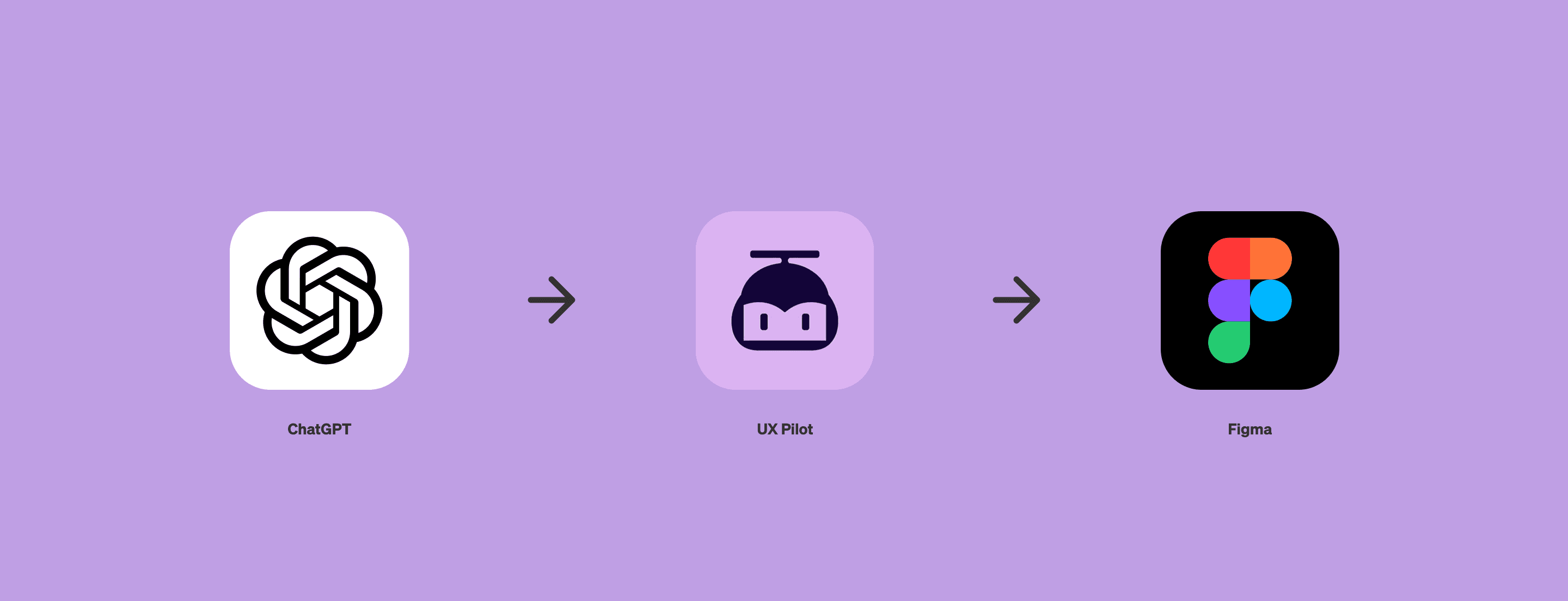
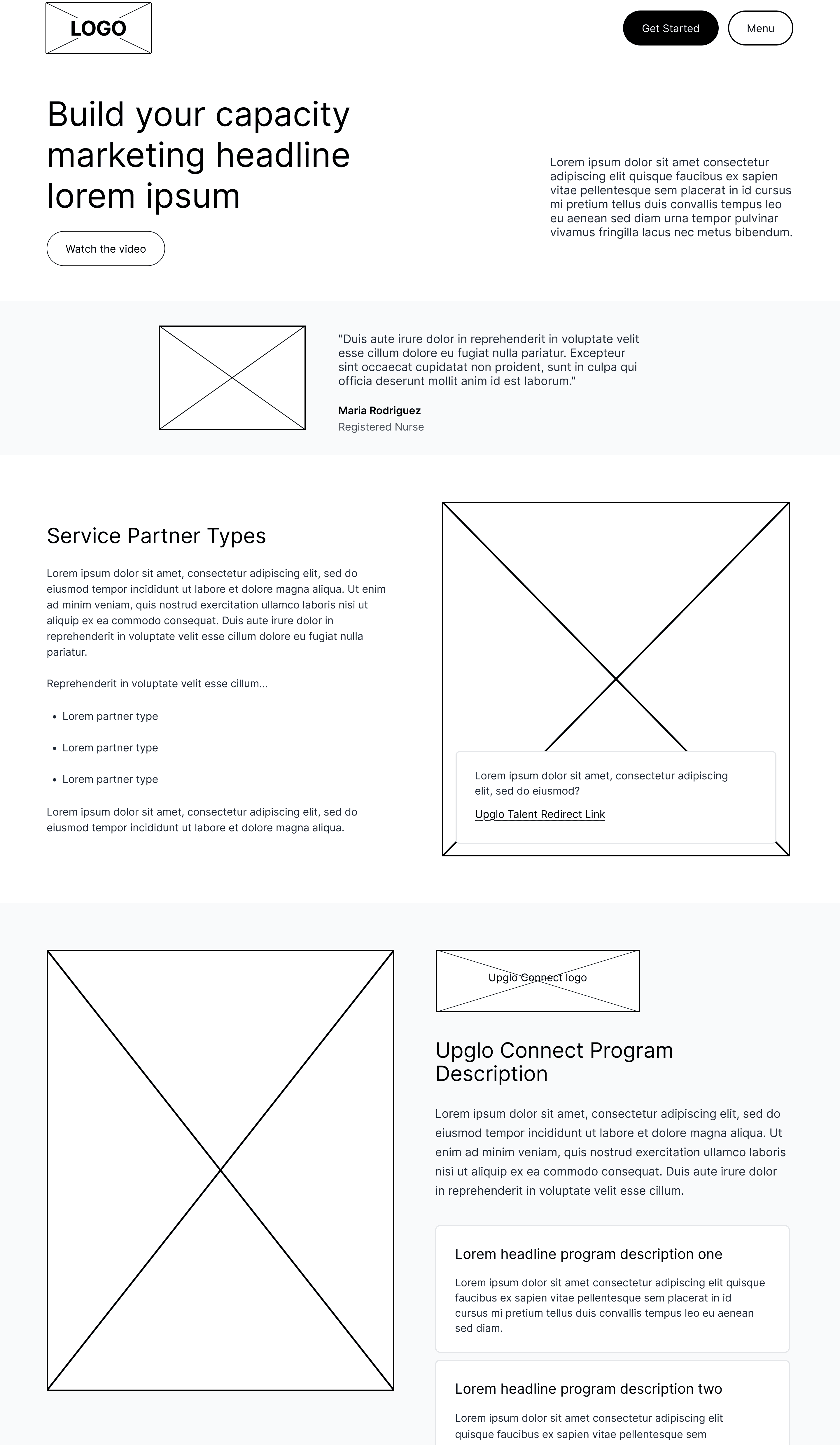
This project marked the first time I brought AI tools into my design process. I worked with ChatGPT to think through page structure, then used it to generate prompts for UX Pilot, which produced editable wireframes I could bring directly into Figma. The output wasn't always perfect, but it was easy to refine once in Figma, and the workflow significantly sped up how quickly wireframes came together across a site of this scale.
The approach proved effective enough that it's become part of how I approach wireframing since.



03
Visual System

I brought the branding to life across the site using a set of multicolored ribbons created in Adobe Illustrator, paired with arced shapes and radial gradients that blended into soft, glowing color spots throughout each page's background. Together, these elements gave the site a warm, inviting visual language that carried the new brand identity from page to page.
On a few content blocks, I designed a two-column scroll interaction: an arced shape built from three staggered layers, each wider and more transparent than the last, with the smallest, fully opaque layer on top. On scroll, the layers spread across the section, gradually covering the image beneath as the adjacent text scrolled into view. It added a small moment of motion and polish within an otherwise static page.
The Outcome
The redesigned site launched in early 2026, giving Upwardly Global a simplified, easier to navigate experience alongside a new visual identity that reflects its mission. The project also marked a turning point in my own process, introducing an AI-assisted design workflow that has since become part of how I approach new projects.

Contact
Get in Touch
lee21nayeon@gmail.com
© 2026 Nayeon Lee