Enter password to view case study
Brewing an identity as approachable as it is artisanal.
client
Next Door Pour
role
Brand Identity, Logo Design


The Challenge
A brand with a name and a tagline, but no face yet.
Next Door Pour needed a visual identity before the brand existed in any form. The brewery's ambition was specific: sell into local restaurants across Southern Maryland while building a brand that felt both elevated and unpretentious. The client's brief centered on a single idea: doors, and the sense of adventure that comes with trying something new behind them. The tagline they'd already landed on, "Make your next pour a Next Door," set the tone.
The mark needed to earn that same wit and warmth visually, without tipping into gimmick.
The Project
I was brought on to design the brewery's logo from the ground up, with two full concept directions presented up front and a defined revision process to follow. With no existing visual language to build from, every decision, the typography, the color logic, the central motif, had to introduce the brand for the first time.
role
Brand Identity, Logo Design
Client
Next Door Pour
year
2026
01
Concept Exploration
Two directions, two different bets on what "approachable artisanal" could mean.
The client's brief came with a clear visual reference: a row of doors, each one different, evoking a sense of discovery. Working from that starting point, I developed two distinct concepts.


The first, The Artisanal Threshold, built directly on the client's own inspiration. Three custom, hand-rendered doors repeated in a horizontal rhythm, each one grounded in a different piece of the brand story, Southern Maryland's architectural history, the idea of exploration, and the "next door" welcome itself. Every door was drawn from scratch for this project. Paired with Richler Pro Highlight, a serif with just enough polish to feel elevated, and a turquoise-and-chestnut palette, the mark reads as a premium seal, something that could sit on a bottle label or hang above a tasting room door.
The second, The Minimalist Pour, took the opposite approach: strip the idea down to a single graphic mark. One arched door with line work suggesting an upside-down bottle mid-pour, a scatter of bubbles hinting at the brewing process, and a navy-and-orange palette built to bridge "established" and "adventurous" in one hit of color. A monochrome variant addressed scalability, ensuring the mark held up at small sizes on taps and packaging.
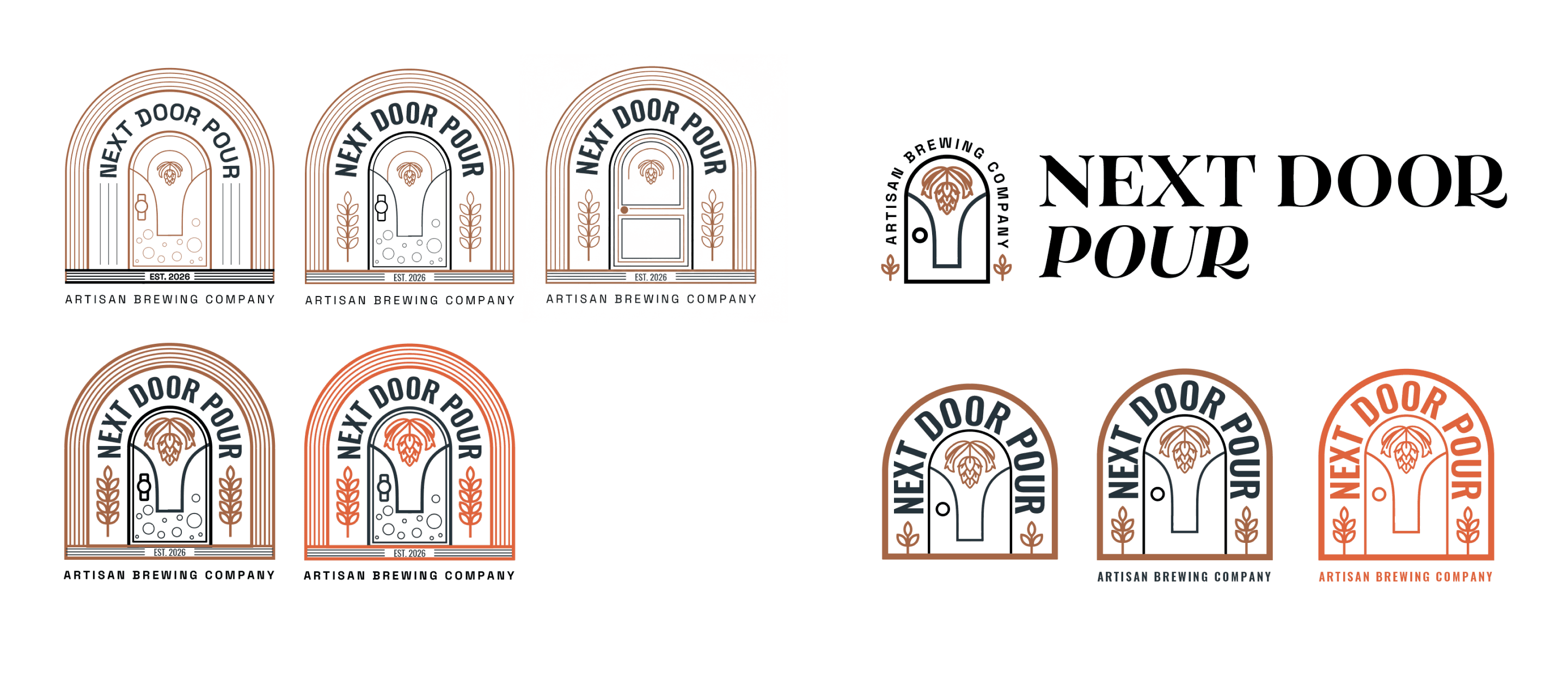


Presenting two genuinely different territories, one illustrative and narrative, one graphic and iconic, gave the client a real choice between two different brand personalities, not just two skins on the same idea.
02
The Chosen Direction
Three doors, three stories.


03
Refinement
A fourth door, born from the neighborhood itself.
Once the direction was approved, the client proposed expanding the pattern to twelve unique doors, one for every repetition in the mark. Given the scope of the original two-concept engagement, that wasn't feasible without adjusting terms. We agreed on a middle ground: one additional door, added to the rotation alongside the original three, bringing four unique stories into the repeating pattern instead of reopening the full illustration process from scratch.


The client's idea for that fourth door came from a well-loved spot literally next door to the brewery, a fitting nod given the brand's own name and origin story. Rather than reproduce that door's signage directly, I translated its lettering into the shape of the door's framing and panel details, carrying over its small central window as a quieter reference rather than a copy. An early version included just a mustache shape within that window, a subtle echo of the original without recreating the full face. The client and I ultimately agreed the window alone told the story more cleanly, so the mustache was dropped in favor of a simpler, empty threshold.

04
The Finished Mark
A logo built to feel like a seal, not just a mark.

The completed logo brings together illustration, type, and color into a single cohesive design. The four hand-rendered doors sit in a horizontal row, framed by a leafy scroll that lends the mark the feel of a premium, hand-stamped seal rather than a flat logo. Richler Pro Highlight, a serif with enough polish to feel elevated without losing warmth, carries the wordmark, striking the same balance the client's "approachable artisanal" brief called for from the start.
Color does the same double duty. A vibrant turquoise gives the primary version a fresh, modern energy on light backgrounds, while a chestnut-brown knockout version steps in for dark backgrounds, offering a grounded, more traditional alternative without losing legibility. Together, the two versions give the logo range across different label treatments and print applications.
The result is a logo that reads as established and characterful, confident enough to earn a spot on a shelf next to breweries that have been pouring for decades, even before Next Door Pour has opened its doors.
The Outcome
The final logo was approved and delivered, ready to carry Next Door Pour's brand forward as it moves toward launch. What started as a single ask, design a logo, became a small brand world in miniature: four doors, four stories, one mark built to invite people in.
Contact
Get in Touch
lee21nayeon@gmail.com
© 2026 Nayeon Lee