Giving a beloved foundation the website its mission deserves.
client
Newman’s Own Foundation
role
UI/UX Design, Creative Direction, Wireframing
collaborators
Strategy, Illustration, Development

The Challenge
A foundation doing serious good, held back by a website that looked dated, and made their most important content nearly impossible to find.
When most people hear "Newman's Own," they think of Paul Newman's face on a salad dressing bottle. What's less visible is that every dollar of profit from those products funds a foundation doing serious work — grants supporting children facing adversity, Indigenous food justice, nutrition education. The Foundation's old website didn't reflect any of that weight or warmth. It looked dated, felt disorganized, and clashed visually with the polished Newman's Own retail brand sitting right next to it on the internet. For an organization whose credibility depends on donors, grantees, and partners trusting them, that mattered.
The core problems were two-fold: the visual identity hadn't kept pace with the brand, and the wayfinding was genuinely confusing. Key questions a first-time visitor might arrive with, like who has the Foundation funded and why, where their grantees are located, and what the story is behind the Newman's Own model, weren't easy to answer. The Foundation had rich stories to tell and a wide network of grantee partners, but the site's structure kept both buried. The client came in knowing they wanted something more engaging and story-forward; part of the design challenge was figuring out what that actually meant architecturally.
The goal wasn't just a visual refresh. It was to make a site that felt as purposeful and alive as the Foundation's actual mission.
The Project
Completed in 2024, this project was owned end-to-end on the design side. I led wireframing, visual design, and creative direction throughout. Sitemap and content strategy were collaborative, and QA was handled together with the development team. The site's visual personality was shaped in large part by two illustrators: Andrea Onishi, commissioned directly for the Foundation site, and Fanny Gentle, whose illustrations were originally created for Newman's Own product packaging and licensed for use here.
role
UI/UX Design, Creative Direction, Wireframing
Collaborators
Strategy, Development
Illustrations
Andrea Onishi, Fanny Gentle
Client
Newman’s Own Foundation
year
2024
01
Web Branding


The previous site's typography was one of the first things that needed to go. It read as a default template choice, slightly childish and unpolished, the kind of font that signals "no one made a deliberate decision here." Swapping it for Saans, a refined and contemporary sans-serif, kept the approachability of the original while adding the sophistication the Foundation's credibility deserved. Similar enough to feel familiar, different enough to feel intentional.
The color palette got a similar upgrade. The original leaned into primary colors, think crayons rather than craft. Brightening the blue, shifting the red toward a red-orange, and introducing a rich eggplant purple gave the palette more life and nuance. A dark, vegetable-y green pulled from the brand's secondary palette added contrast and felt right at home for a food-rooted organization. The background moved away from stark white to a soft off-white, closer to natural paper than printer paper. A small change that makes the whole site feel a little more organic and a little warmer.

The illustrations by Andrea Onishi and Fanny Gentle were the final layer that pulled everything together, giving the site a handcrafted personality that no font or color choice alone could achieve.
02
Navigation & Information Architecture


One of the biggest challenges going into the redesign was content discoverability. Key questions a visitor might arrive with, where are the grantees located, why does the Foundation fund what it does, how can someone apply, weren't easy to answer. A sitemap audit revealed that much of this information was either buried in vague sections or missing altogether.
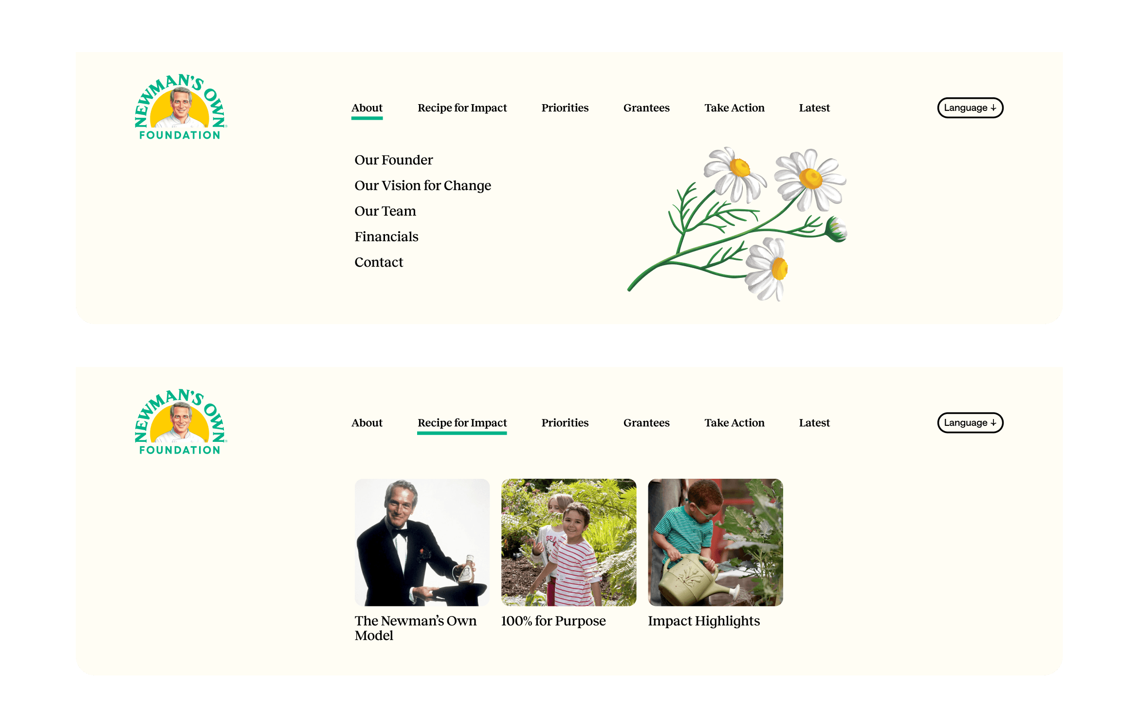
The old navigation reflected how the organization thought about itself internally: Mission, Impact, Our Founder, Our Work, Get Involved, News. Clear enough from the inside, but not particularly useful if you're a first-time visitor trying to orient yourself.
The restructured navigation reframes everything around what a user is actually looking for: About, Recipe for Impact, Priorities, Grantees, Take Action, Latest. Each label does a little more work. "Grantees" is unambiguous. "Recipe for Impact" nods to the Newman's Own food brand while signaling the Foundation's model. "Latest" creates a dedicated home for the stories and updates that were previously scattered or hidden.
The goal wasn't just tidier labels. It was making sure the Foundation's most important content, their grantee network, their funding priorities, their impact stories, had a clear and findable home.

03
Design Challenges
No project gets from wireframe to launch without friction, and this one was no exception.
The interactive grantee map was one of the more complex pieces to get right. Early stakeholder feedback flagged that the map's interactive elements weren't immediately intuitive. Dots on the map didn't read as clickable, and dropdown menus lacked clear affordance. We addressed both: map pins were redesigned to a more recognizable style, helper text was added to guide users toward the interactivity, and dropdown labels were updated to prompt selection. Small changes, but they meaningfully improved the experience.

The Impact page's intro section graphics sparked a different kind of conversation. My instinct was to keep all visuals in the same illustrative style as the rest of the site, cohesive, handcrafted, and consistent with the illustrations woven throughout. The client had a different vision and preferred a flat graphic style for that section, which included both the animated salad dressing bottle and the data visualization below it. I made the case for visual consistency, but ultimately we executed the client's direction. It's a compromise I can acknowledge honestly. I still think a unified illustrative style would have felt more seamless, but the clients were happy with the result, and that matters too.


04
Impact Page & The Newman's Own Story
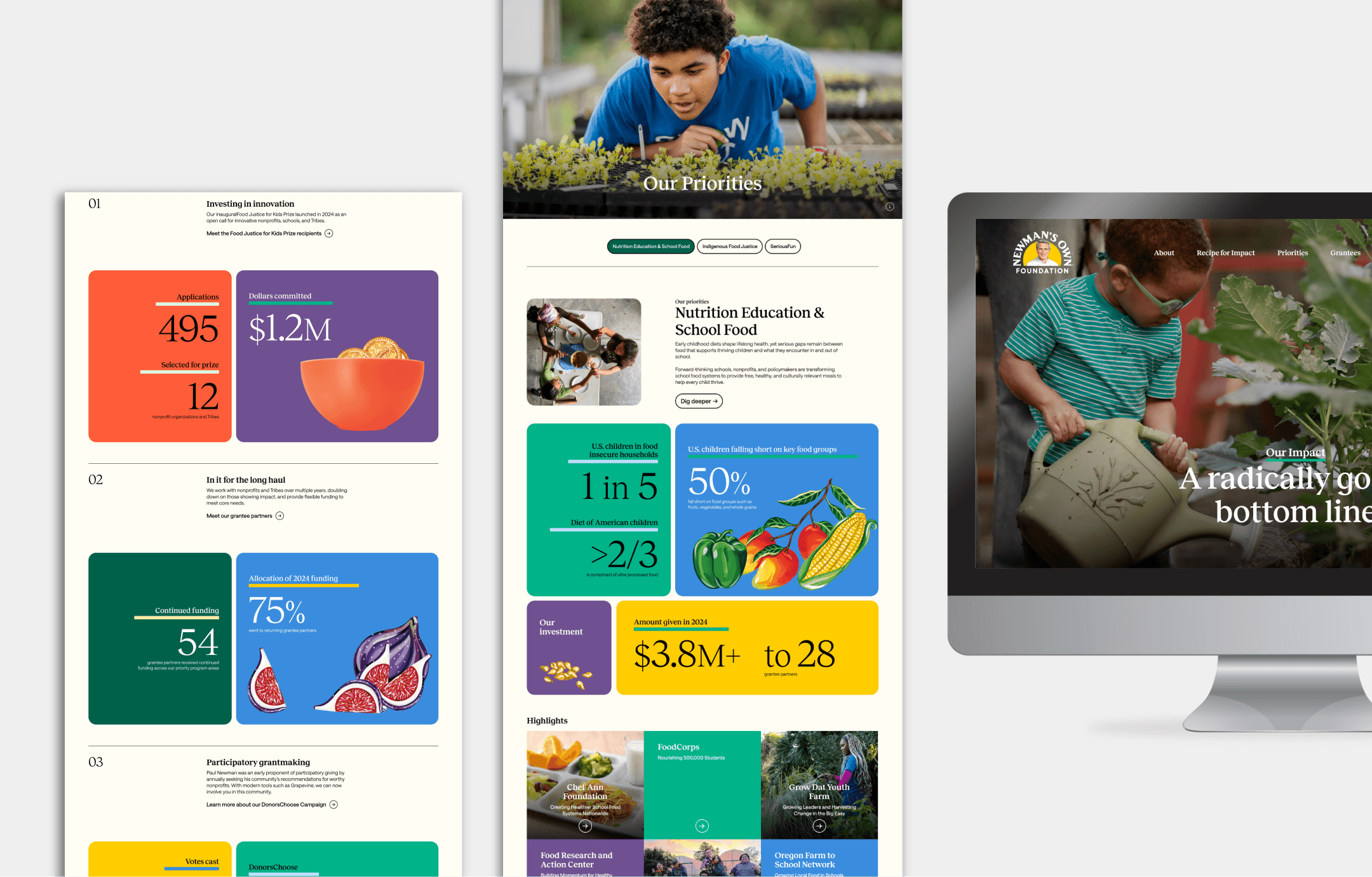
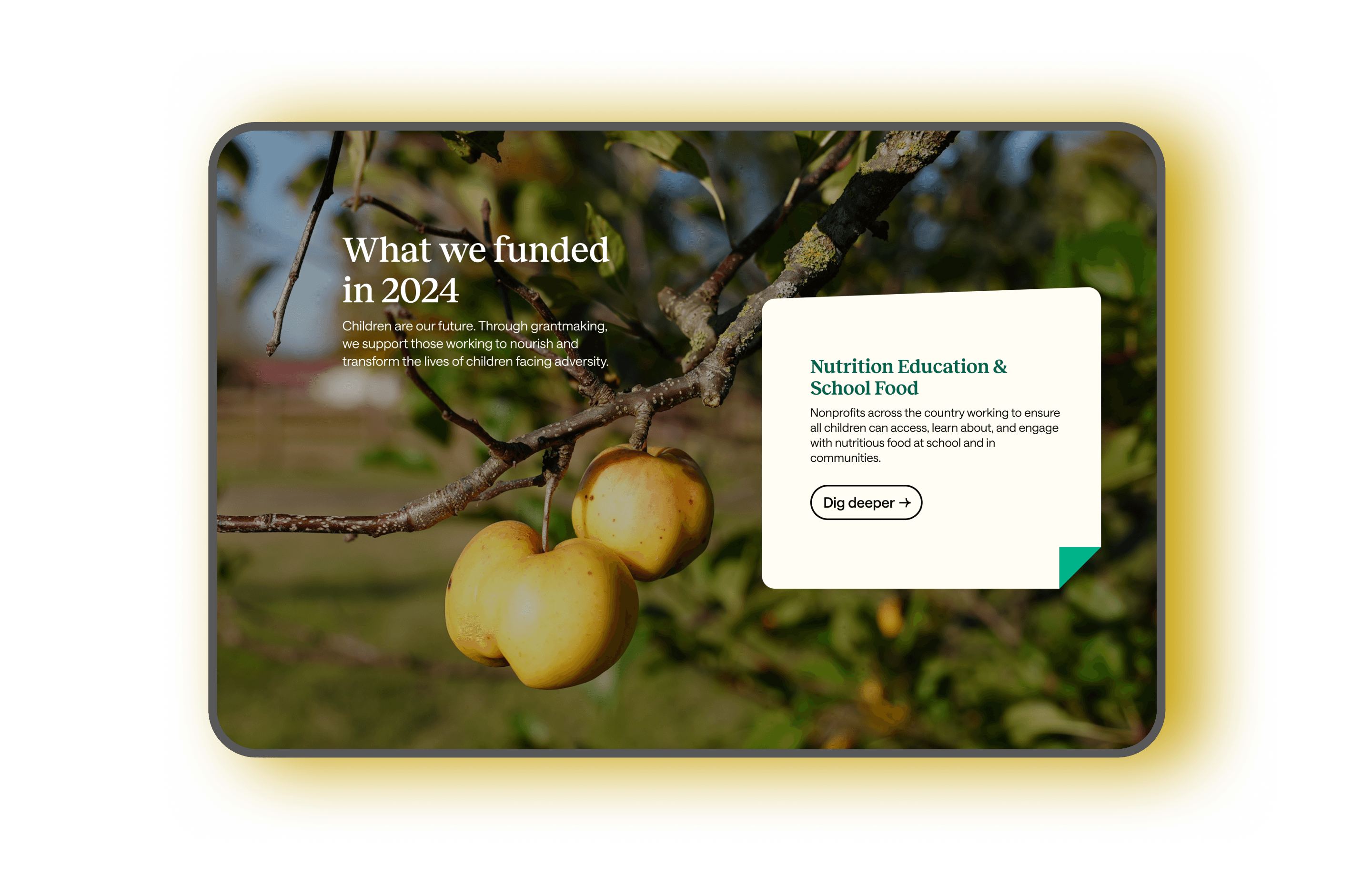
The Impact page is the most visually dense page on the site, and intentionally so. It opens with animated statistics, including a salad dressing bottle that fills up in real time as a funding figure ticks upward, a small interaction that immediately roots the Foundation's impact in its product origins. Throughout the page, colorful grid cards styled like post-its open into overlay pop-ups with grantee stories and additional context.
Images are fixed in place while text boxes scroll up alongside them, with each new image appearing in place as the associated content changes. Stat sections use parallax scrolling to layer over one another as you move down the page. A tabbed section toward the bottom dynamically loads impact stories and statistics for each of the Foundation's three priorities, letting users explore the work that matters most to them.
The Paul Newman section was a different kind of design challenge, less about information architecture and more about capturing a feeling. The horizontal scroll experience was designed to feel like a scrapbook, loose and celebratory, the kind of thing made by people who genuinely loved the guy. Silly candid photos, Paul holding a bucket of popcorn with popcorn raining everywhere, sit alongside quotes that show exactly who he was. "Share the good fortune with others."


The Outcome
The site launched in 2024 and the reception from the client was everything you hope for at the end of a long project. In the new year, one of the Foundation's team members reached out just to say thank you and share how much she had enjoyed working with us. No ask, no follow-up, just genuine appreciation.
This project holds a special place for me. Of all the redesigns I've worked on at the agency, this is one of my favorites. The Newman's Own Foundation is doing genuinely good work in the world, and getting to help tell that story more clearly and beautifully felt like the kind of project you get into design for.

Contact
Get in Touch
lee21nayeon@gmail.com
© 2026 Nayeon Lee