A decade of impact, redesigned into a site people come back to.
client
FoodCorps
role
UI/UX Design, Creative Direction, Wireframing
collaborators
Freelance Design, Illustration, Animation, Development

The Challenge
The hardest part wasn't making it beautiful. It was making it worth revisiting.
FoodCorps had over a decade of impact connecting kids with healthy food in schools, but their site wasn't built to carry that story. During discovery, a stakeholder interview surfaced a hard truth: people rarely visit an organization's own website more than once. A visually appealing redesign wouldn't be enough.
The site needed a reason for funders, partners, and supporters to come back.
The Project
FoodCorps came to us for a full site redesign spanning visual rebrand, UX, and content strategy. Given the scope, the project took several months to complete, with dozens of pages, modules, and technical builds like the map and Case for Food to design and coordinate. I led the project end to end, from creative direction through wireframing and design, managing a freelance designer on additional design pages while directing the illustrator, animator, and developers who brought the site to life.
role
UI/UX Design, Creative Direction, Wireframing
Collaborators
Freelance Design, Animation, Development
Illustrations
Namrata Vansadia
Client
FoodCorps
year
2022
01
The Rebrand

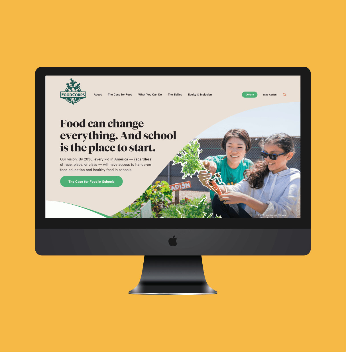

I led a full visual rebrand, carefully selecting from FoodCorps' extensive color palette to create a more focused, cohesive look while staying true to their brand. Tiempos Fine anchors headlines, Basier Circle carries body copy. Select photography, like produce in a garden box, got a hand-drawn outline treatment for an organic touch.
Wavy shapes and section dividers guide the eye through the page, and animated SVG icons add bursts of youthful energy throughout. The result feels youthful without tipping into childish, earnest about the work with warmth for who it's for.
02
The School Partner Map


I led the UX and visual design for a map of FoodCorps' school partners nationwide, one of the most requested pieces of the redesign. With locations clustered densely in some areas, nearby schools condensed into a single number that expanded on zoom, keeping the map readable at any scale. Clicking a location opened a full-screen overlay with school details, each with its own unique URL so the client could link directly to a specific partner.
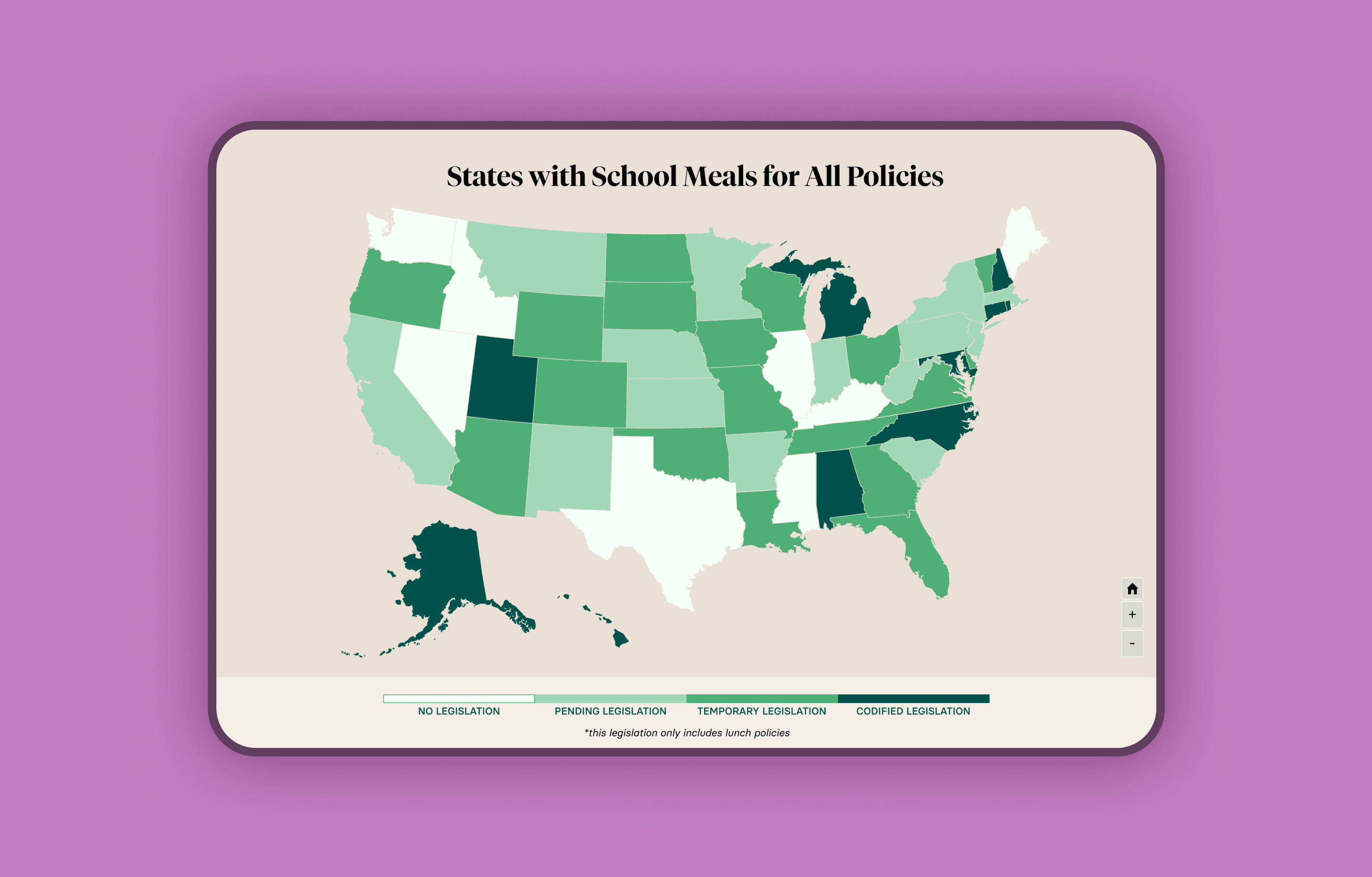
A year after launch, we revisited the map with a new approach. Rather than showing every dot at once, the initial view now highlights states where FoodCorps has a presence. Clicking a state zooms in, surfaces that state's locations, and opens a side panel listing each school with contact details, plus a reset button to return to the full map. FoodCorps later asked for a policy-focused version of the same map, color coded by legislative status (no legislation, pending, temporary, codified), with each state opening into a page of policy details, action items, and related content.

03
The Case for Food


The Case for Food is a scroll-animated story explaining why school food matters, built to be the most immersive piece of the site. I brainstormed the storyboard and illustration direction, then designed each scene with animation direction before handing off to an illustrator and animator. Developers then translated the finished animation into a scroll-driven experience, timed precisely to the user's scroll position. The animation was later pieced into a standalone video, replacing the scroll experience so the story could be shared more flexibly without asking users to scroll through it all.
See the original scroll experience in action:
04
The Skillet
The Skillet is FoodCorps' resource hub, built to directly answer the discovery insight that people rarely return to an organization's own site. I led the wireframing, UX, and visual design for a space that brings together blog posts, stories, news and press coverage, and downloadable resources like lesson plans and program guides in one easily discoverable place. Instead of a single static site, FoodCorps now had a reason for funders, partners, and educators to check back regularly.


The Outcome
FoodCorps has stayed with the new brand since launch, a strong signal that the redesign continues to serve them well. The site's relationship with FoodCorps also led directly to our work with Newman's Own Foundation. Most recently, FoodCorps returned to restructure the site's content as their programs expand beyond school food, keeping the same visual foundation from the original redesign intact.

Contact
Get in Touch
lee21nayeon@gmail.com
© 2026 Nayeon Lee