Making the case for what works, one agreement at a time.
client
Educators for Excellence
role
UI/UX Design, Design Lead
collaborators
Strategy, Design (Style Tile & Photo Treatment), Development

The Challenge
Educators for Excellence had a wealth of material to work with: research on what strong teaching looks like, examples of contract provisions, and real-world case studies showing how the right language could shape better outcomes for students and teachers alike. The challenge wasn't a shortage of substance. It was volume.
None of it would matter if teachers, the site's largest audience, couldn't find what applied to them.
The content needed a structure that could hold a lot of complexity without asking visitors to wade through it.
The Project
The initiative took shape as "Where We Agree," a microsite built to hold all of that material, research, contract language, and case studies, in one place. The team had proposed an interactive quiz to help visitors find the content most relevant to them, along with a system for organizing case studies by issue area and location. Turning those ideas into something that actually worked meant wireframing the navigation, the quiz flow, and the filtering system from the ground up, work I led across the entire site.
The visual identity followed a style tile developed by a freelancer, built around a watercolor treatment that echoed the checkmark in the "We" of the new logo. That direction carried across the full site design.
role
UI/UX Design, Design Lead
Collaborators
Strategy, Branding, Style TIle & Photo Treatment, Development
Client
Educators for Excellence
year
2024
01
Information Architecture


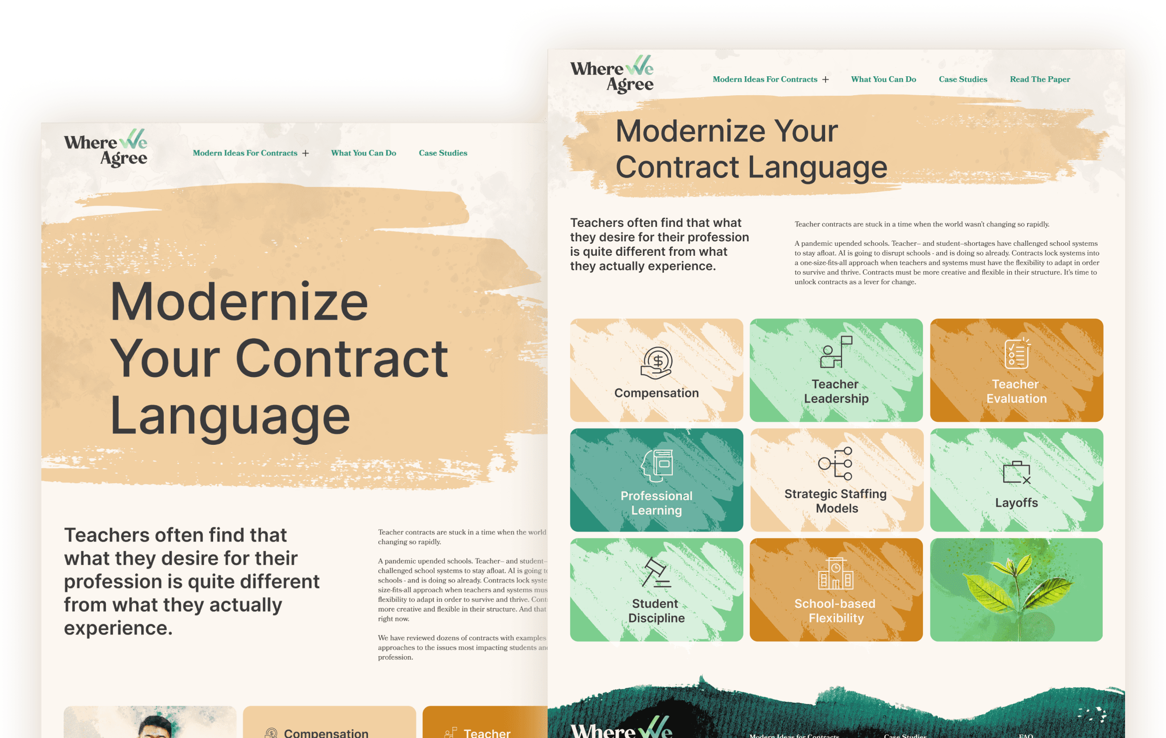
With so much to organize, the site needed more than a menu. Thematic icons helped visitors orient themselves quickly, while an interactive quiz pointed them toward the content most relevant to their role and interests. Breadcrumb trails, anchor links, and tags gave visitors multiple ways to navigate without losing their place.
Case studies, real examples of contracts improving outcomes for teachers and students, were organized by issue area and location, so visitors could filter down to what applied to them. Multiple pathways to share content by email and access the full report were built into the site, making it easy to pass information along.


02
Visual Identity in Practice
The new "Where We Agree" logo used a watercolor texture to bring the checkmark inside the "W" to life. That same texture carried through the rest of the site: painterly brushstrokes, soft watercolor-style imagery, and subtle washes of color gave the microsite a cohesive, human feel, one that softened dense policy content without undercutting it.


03
Where We Agree 2.0
After launch, Educators for Excellence ran a round of user testing with teachers, the site's primary audience. The feedback was clear: too much scrolling made information harder to find than it needed to be.
The revamp addressed this directly. The header and typography were refined for clarity. Issue area pages, previously long vertical stacks of content, became rotating carousels. Recommendation details collapsed into tabs that loaded dynamically, cutting down on scroll without cutting down on substance.


The Outcome
Where We Agree gave Educators for Excellence a home for a large and complex body of research, one built to be explored rather than endured. The quiz, filtering system, and navigation gave teachers a way into the content that matched how they actually wanted to find it, not just how much of it there was.
The 2.0 revamp proved the site could keep improving. Listening to the people using it most led to a version that felt lighter and easier to navigate, without losing any of the depth that made the original research valuable.
Contact
Get in Touch
lee21nayeon@gmail.com
© 2026 Nayeon Lee